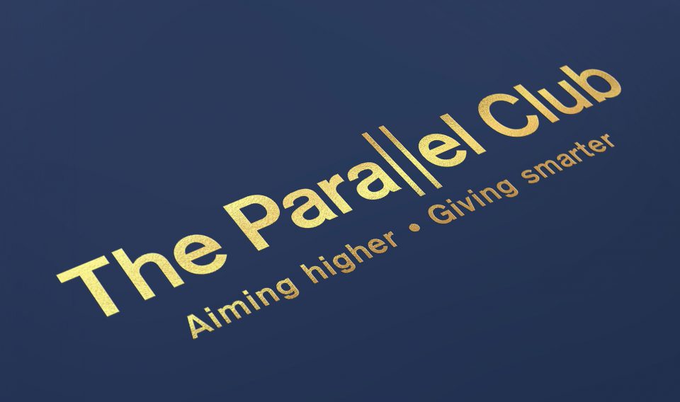
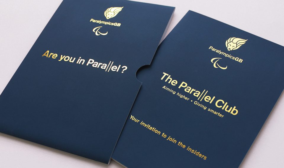
Paralympics GB; The Parallel Club
Key thought:
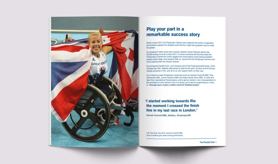
‘The Olympic Games and the Paralympic Games; the athletes and the supporters. It’s all about being in parallel.’
The British Paralympic Association, known as Paralympics GB in competition years, wanted to engage high value prospects via a new giving club. First came the name, which references the equal stature of the Olympic and Paralympic Games and the way club members would come alongside the athletes – both metaphorically (by giving) and literally (via access to exclusive events). Then came the messaging, distilled into a beautifully designed brochure, in a lovely tactile stock and with an outer sleeve to reinforce exclusivity. The client commented, this brochure set a new standard for how the organisation should present itself.
Assets created:
Name, key messaging, logo, visual identity, brochure and sleeve – all co‑created with the design and project management team at Click Creative.
Images copyright onEdition 2016©.