Speakeasy; brand development
Key thought:
‘These people are clearly brilliant. Let’s get everything out of the way of others being able to see that.’
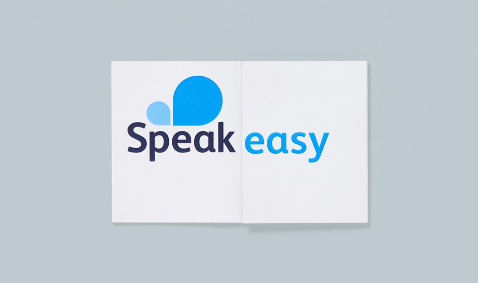
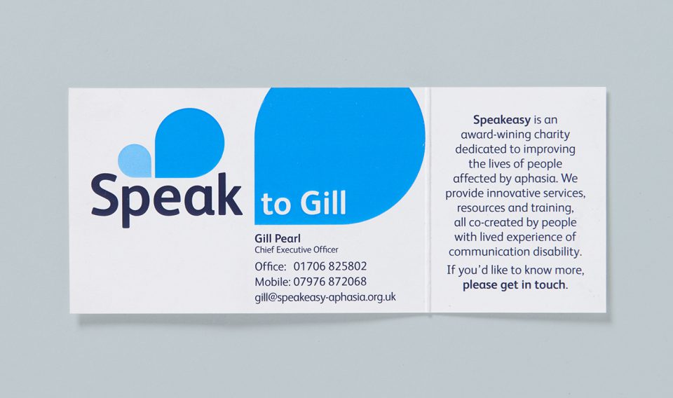
Speakeasy is an extraordinary charity that supports people with aphasia; a communication disability, often caused by stroke. It is run on a shoestring by remarkable speech and language therapists, Stephanie and Gill, who needed a better (clearer, more coherent and contemporary) brand identity to do their fantastic work justice. I worked with my long-term collaborators, Click Creative, to deliver a set of core assets, which more successfully capture the charity’s straightforward brilliance. The logo is both speech bubble and breath, referencing the relief people feel when they meet Speakeasy and can finally exhale.
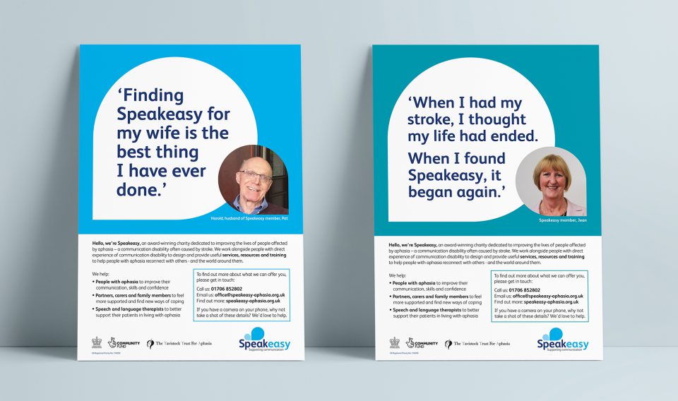
Assets created:
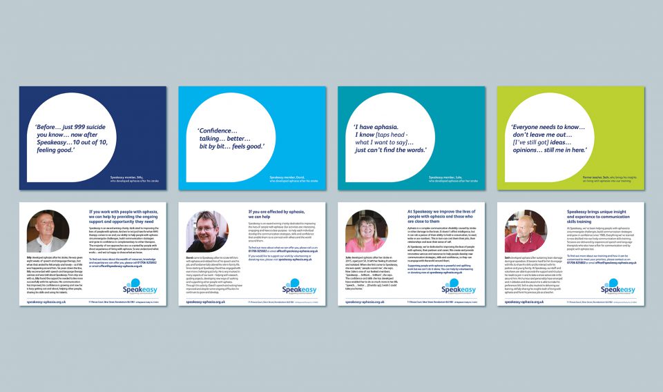
Visual identity, logo, key messages, copy for grant applications, posters, postcards, business cards, exhibition banners – all co-created with the brilliant team at Click Creative.
